
Mobile Friendly Website Design is Now a MUST!
When it comes to providing a positive user experience, mobile friendly website design is now a must! This is especially true if the website in question is your WordPress business website. If your website is NOT mobile friendly it will result in less traffic and lost income revenue.
2022 Mobile Friendly Update
Since I originally published this post a few years ago, things have changed even further. Of course, mobile friendly is still a MUST, but now it goes way beyond that. Your web pages MUST also load fast and be accessible too!
Displaying a mobile friendly website will not only make your visitors happy but your site will receive higher search result rankings. Even if your website is currently fine for mobile device users, this post is still worth reading.
Building a custom website in today’s world requires research, forethought and the right mindset. We MUST visualize what our visitors will see when viewing each page or post on their phones. Text needs to be be easy to read, on top of a contrasting background. Keep images small and if using animations try the Lottie animations. Even those should be used sparingly. Avoid using tabs, accordions or any other elements requiring the use of Javascript. Use great plugins and keep your site lean and mean!
Take the Mobile Friendly Website Design Test
Find out now if your website is considered mobile friendly. If your website passes the test, great! If not, come on back here to learn more!
How did you do? If you came back to this post, it’s likely your site failed the test! In that case, let’s see if we can provide some enlightenment about mobile friendly website design.
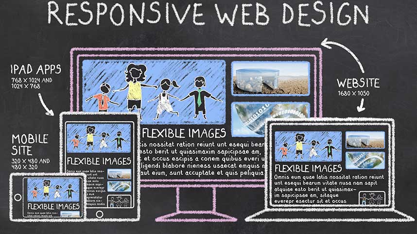
Mobile and Responsive Web Design
First off, it’s not about just building a website to display well on mobile devices. It’s not about any specific device but rather, it’s about displaying your site well on almost ALL devices. To accomplish this, forget the “mobile friendly website design” part, and start thinking responsive! With a responsive design your website will appear nicely on all devices.
Remember, your visitors will be using devices of different types and sizes. It’s just not cost effective to design specifically to every type of screen size available. That’s one reason we like going the responsive route. We only need to stay focused on providing your visitors a positive experience, no matter the device. A responsive design will pass the mobile friendly test and help you maintain your SEO rankings as well.
As freelance web designers, we use mobile friendly website design on every site we build. In order to accomplish this we correctly use responsive code and proper site structure. It’s about more than the code though. It’s our whole thought process while laying out the site structure. We must think through how various site elements will stack and appear when the screen size varies from large, to small.
Unless the client has a particular reason to design to a specific device, our sites appear nicely on most every device, eliminating the need to focus on one specific device. Personally, I like simple general responsive designs that appear nicely on all devices. Others prefer a site more geared for mobile. It might also depend on your audience. I have a client who specializes in selling aircraft parts. As of 2022, over 90% of his website visitors are using large screen devices. On most sites, 60 to 70% of the visitors are using their phones.
Video – Difference Between Responsive and Non Responsive Websites
I created a short screencast video showing the difference between a responsive and non responsive website. The responsive site shown in the video is based on our mobile friendly website design and passed the Google test.
Difference Between Responsive and Non-Responsive Website
Pretend for a moment you have a website home page with 3 columns. It appears perfectly on a desktop or laptop screen.
Now, imagine slowly shrinking the horizontal size of the screen, from right to left. Depending on the type of web page layout used, those columns will probably stack on top of each other, ultimately resulting in a single column page.
Now, what happens if we have an important call to action in center column. That might display perfectly on a large screen device. However, viewing this same page on a mobile device, the middle column will probably stack down under the column on the left. If so, your most important call to action is moved below an element of less value or importance.
What is Responsive Design Really About?
Designing a responsive and mobile friendly website is about more than using percentages and modern code. It’s also about proper site structure so that elements appear as desired. Seriously, mobile friendly website design is a MUST and sometimes it’s really not that difficult.
If you have a non responsive WordPress website there used to be a few plugins out there that will automatically make your site somewhat responsive. At least good enough to pass Google’s mobile friendly test. This was only a short term fix but it’s better than nothing! This won’t work on all WordPress themes, but if your site is not mobile friendly, you have little to lose by trying!
A Better Responsive WordPress Website Solution
If you’re looking to make your existing WordPress site responsive probably the easiest way is to install a new theme. There are a number of well coded, free themes available in the repository. If you are not a developer some of the best themes for non coders are Kadence, Generate Press and Astra, just to name a few. If planning on using the WordPress block editor to build your site, try Kadence or Generate Press. They all work with most page builders. If going the page builder route, I highly suggest Beaver Builder (The preceding link is an affiliate link). Elementor works fine and they do an amazing marketing their product, but there’s way too much bloat and Beaver Builder is way faster!

Unless you pay a developer to build you a custom theme, the consumer themes mentioned above are terrific choices. Even though I can code my own theme, I used Kadence on this site. Why? I’m way too busy to build it myself, Kadence does a terrific job and is well supported. The bottom line is, for responsive, mobile friendly websites, it all begins with your mindset and then the theme. There’s much more to do, but a good theme is the first step.
Honestly, if your website is not mobile friendly, it’s time for a new website and it’s not that difficult. If you’re not one to go it on your own, hire a good web development freelancer to get the job done for you.
Contact us today and let’s see if we can help!